work
Malchow book cover mock-up
Stanford University Press
This book explores what the author calls "the Americanization of Britain" during the post-World War II period, focusing on how a range of cultural issues from the 1960s resonated on both sides of the Atlantic. I did some research and discovered that while tea bags were invented in New York in 1908, the "tea bag revolution" in Britain did not happen until years after the war when material shortages were no longer an issue; exactly the time period discussed in the book. Then I found the absolutely perfect image on iStockphoto.com. It's not always this easy. Click MORE to see a few of the comps.
MoreWolff book cover
Stanford University Press
The author had a very clear idea of what he wanted on the cover of his book. He suggested three ways to incorporate the Metropolitan Museum of Art's painting The Letter by Pietro Longhi, including one using a detail from a black and white engraving by Giovanni Cattini based on the painting. Once I saw the artwork, I agreed that the author’s ideas were the perfect way to illustrate what the book is about: the eighteenth-century trial of a Venetian aristocrat for the sexual abuse of a servant girl. I created six different treatments, including the final one shown here, which features a sepia version of the engraving, focusing on the young girl and the menacing, advancing adult. Click MORE to see the other ideas.
Braverman book cover
Stanford University Press
Author Iris Braverman supplied this incredible eye-catching photo taken at the Louisville Zoo by photographer Lizzie Morrison. My approach here was to add the necessary text while basically staying out of the way of such a powerful image. The treatment of the title and particularly the subtitle—cramming it into the full width of the front cover—reflects how zoos used to be seen as stark, prison-like institutions. The book follows the story of Timmy, the oldest male gorilla in North America, to describe the dramatic transformations zoos have made since the 1970s; how they’ve changed from places created largely for entertainment to globally connected institutions that emphasize care, through conservation and education.

Chang book cover
Stanford University Press
Britian’s Chinese Eye is a study of the differences as well as the overlaps in the visual cultures of China and Britain in the 19th century; the way each culture saw and represented specific things and how this influenced Romantic and Victorian writers, artists, and architects. The author suggested using a willow plate pattern on the cover but admitted that idea might be unexciting. I found a photo of a similar but definitely interesting image on istockphoto.com: a large photo of a Chinese vase with one side cropped off. The subject was very appropriate because blue and white china, including plates, teacups, and vases, is specifically discussed in the book. I placed the full image on the front cover and a part of it, flopped horizontally, on the back cover so it looks like there’s one photo of a complete vase. The design is clean and simple.

Earnhart book cover
Stanford University Press
This book examines US chemical manufacturing facilities’ efforts to comply with wastewater discharge limits and their success at compliance, as well as the role of government monitoring and enforcement at inducing stronger efforts and better compliance. The editor wanted to use some sort of water image because much of that work took place due to the implementation of the Clean Water Act. It wasn’t difficult to find an assortment of interesting images featuring water. The final image shown here is the simplest and the last one I tried. The more challenging aspect of creating the cover was deciding how to treat the lengthy title and subtitle. Using different fonts and varying the letterspacing breaks them into smaller chunks, slowing the reader down a bit and making the information a little easier to absorb. Click MORE to see the other ideas I came up with.
Long book cover
Stanford University Press
This Perversion Called Love explores narcissism, fetishism, and masochism in the 1930s writings of Tanizaki Jun’ichiro, one of the most popular Japanese novelists of the 20th century. The author suggested using persimmons on the cover, since they are a big theme in Chapter 3. The editor referred me to an excerpt from one of Tanizaki’s works in the book, which has got to be the sexiest description of a persimmon I have ever read. (I don’t actually read the entire book that I’m designing a cover for; unfortunately there is never time in the production schedule for that. But I do read the aquisition editor’s notes, the marketing notes, the TOC, the introduction, and the last chapter, in addition to looking through the manuscript and usually having many conversations with the editor.) I scoured online photo sites and found a surprisingly dramatic shot of one persimmon on iStockphoto.com taken by Michal Herman. I centered each word of the title, subtitle, and author’s name on a separate line, added a subtle border of tiny squares, and let that persimmon draw people in.

Elam book cover
Stanford University Press
Author Michele Elam examines representations of mixed race in literature and the arts that are transforming new millennial aesthetics and politics within the so-called post-race era in The Souls of Mixed Folk, published in 2011. The provocative cover image by artist Lezley Saar was provided by the author and is discussed in the book. It certainly caught the attention of more than one of my co-workers as they walked by my desk while I was working on the cover design at Stanford. That never happens. Because it’s a startling image, I used a calligraphic typeface (Zapfino) to soften the impact a little, and deliberately ran the descender of the “f” through the subtitle to create a secondary focal point.

Southern Comfort magazine ad
M.A. in Advertising Design program
Syracuse University
This project is from a summer class at Syracuse taught by David Altschiller of Hill Holiday Altschiller in New York. The assignment was to design a magazine ad for Southern Comfort and also write the copy. Southern Comfort is an American liqueur made from neutral spirits with fruits, spices, and whiskey flavorings. Their customer base has traditionally been an older demographic. The company wanted to increase sales by repositioning the brand to make it more appealing to a younger target audience—young adults in their 20s and 30s. As part of a fleshed-out advertising campaign, I think the catchy, thought-provoking tag line and the unusual, subtly joyful photograph I found online would have done the trick.
Alameda/Oakland Magazine ad campaign
Alameda Pet Hospital
Alameda Pet Hospital is a small business in California which doesn’t often lack for clients. However, some months are busier than others, so APH’s owner wanted to increase the clinic’s visibility. I created an advertising campaign which ran for two years in a popular local magazine that published monthly editions for the cities of Alameda and Oakland. All of the ads featured photos of animals on a plain white background from iStockphoto.com, most of them looking directly at the camera. I wrote the copy, which was usually short and sweet. The ad shown here introduced new evening office hours exclusively for cats, with a clever, familiar phrase that would catch the eye of cat owners, as would the photo of the no-nonsense tabby cat staring right at them. Click MORE to see a selection of the ads.
Morestationery
Alameda Pet Hospital
Like many small businesses, having a consistent brand identity hasn’t been a priority at Alameda Pet Hospital. After seeing the success of the advertising campaign above (a substantial increase in appointments and new clients!), the business owner agreed that it was time to develop a cohesive identity, beginning with the company’s stationery. She wanted a very traditional treatment, and is not yet open to improving the logo she’s had for 20+ years. I started with the business cards. After doing a dozen loose sketches and refining numerous versions of a few of them in InDesign, I presented seven mock-ups, and then adapted the chosen direction for the letterhead and envelope. Click MORE to see the business card comps.
Moreabout
I am an award-winning visual designer, art director, and design manager with many years of experience in both print and digital media.
I've been an art director at three publishing companies and the manager of graphics departments at two multimedia companies. I've freelanced off and on for years, designing books, advertisements, logos, and websites for a variety of clients. My favorite gig ever was job-sharing with the art director at Stanford University Press for two years, where I designed 60 book covers myself and managed another 160 created by freelance designers.
My print work has won awards from Communication Arts Magazine, Print Magazine, How Magazine, the Bookbinders' Guild of New York, and the Advertising Club of the Monterey Peninsula. Digital projects have received awards from Media and Methods Magazine, the Massachusetts Innovation & Technology Exchange, the New York Festivals, New Media Magazine, and the Software Publishers Association.
I have a B.S. Degree in Interior Design from San Jose State University with a minor in English. I've studied graphic design at the Glasgow School of Art in Scotland. I recently earned a Certificate in Web and Interactive Media Design from the University of California at Santa Cruz. I have completed all the requirements for a Master's Degree in Advertising Design from Syracuse University except for the thesis (long story), including going on all the incredible trips to top-tier advertising agencies, design studios, magazine headquarters, and museums in London, Toronto, New York City, Chicago, and San Francisco.
Resumemisc


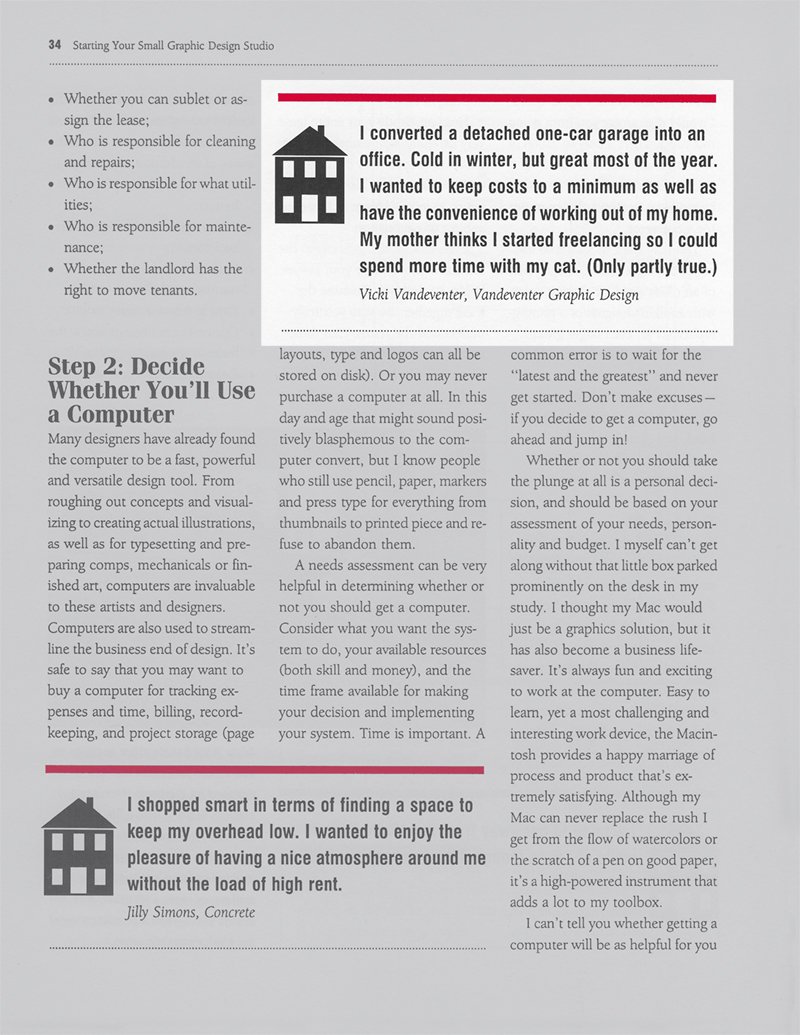
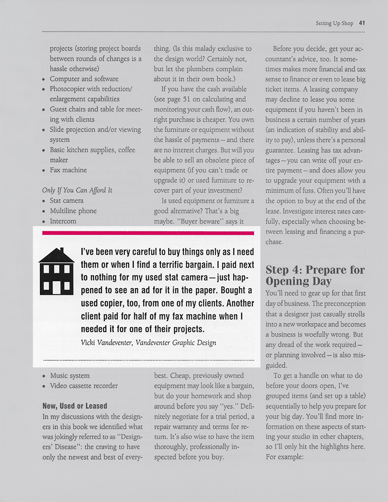
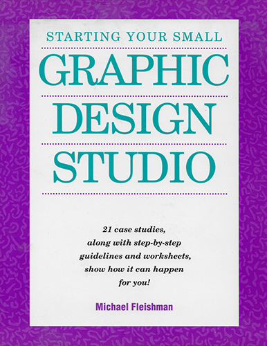
Michael Fleishman saw my work in How Magazine and asked to include it in a book he was writing at the time. Starting Your Small Graphic Design Studio was published in 1993. Some of that material was also included in two later books, Starting Your Career as a Freelance Illustrator or Graphic Designer (2001, revised edition 2012) and Starting Your Career as a Graphic Designer (2014).
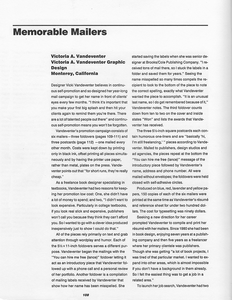
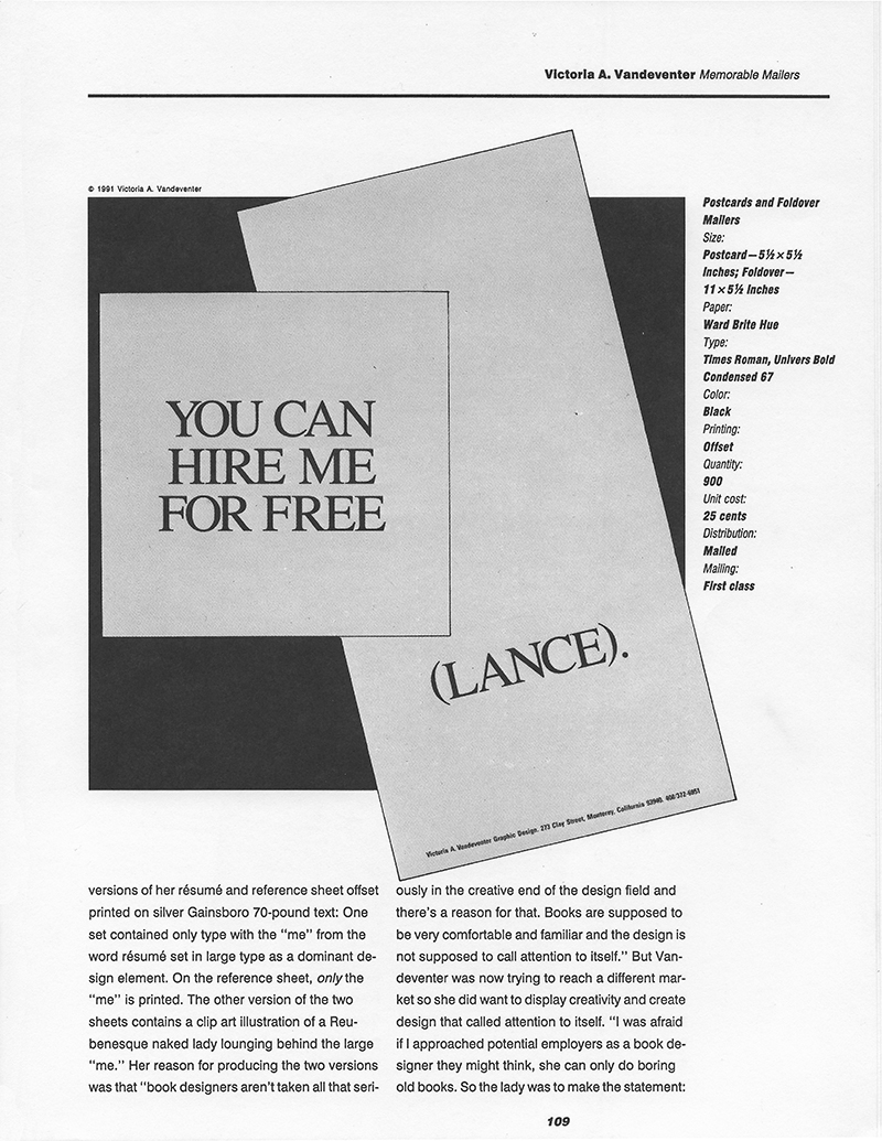


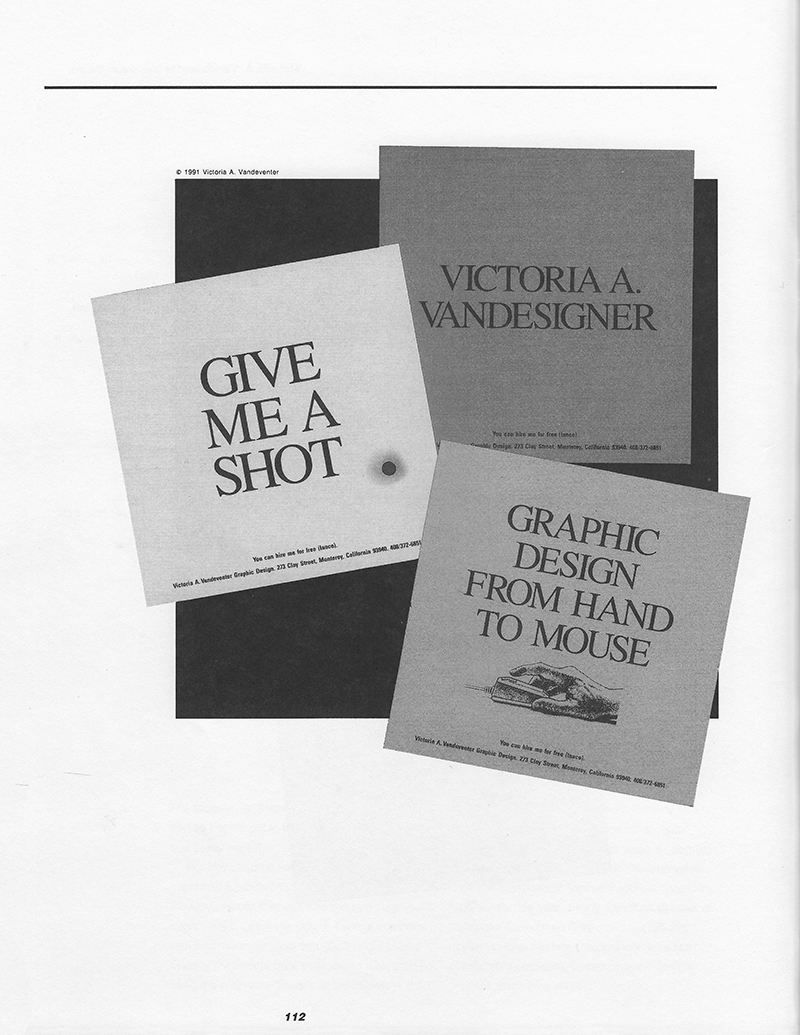
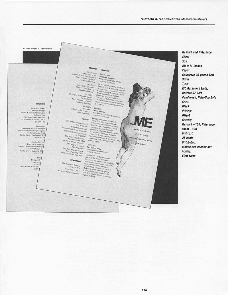
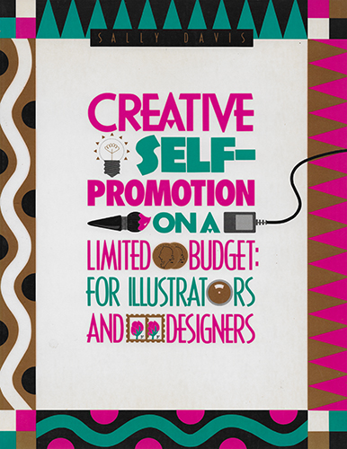
Sally Prince Davis contacted me when she was writing Creative Self-Promotion on a Limited Budget: For Illustrators and Designers, which was eventually published in 1992. She wanted to include my brochure series after seeing it in How Magazine, and asked if I had anything else that might be appropriate for her book. I sent her two versions of my resume, and she went with the risque clip art one, shown above!

